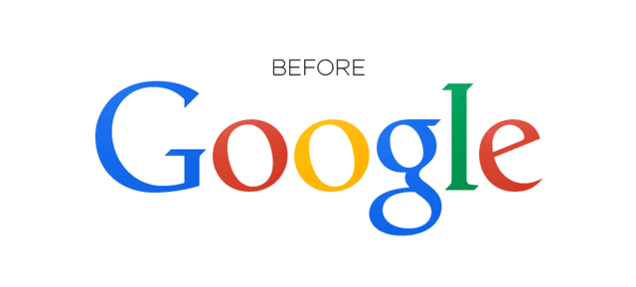
An eagle-eyed redditor has noticed that the classic Google logo has been tweaked and before you start to load the Google page to check out what are the changes, let me tell you that chances are you won’t be able to tell the difference.
That’s because there’s only been a change of 1 pixel. Check out the gif below:
Source: Gizmodo
Why the seemingly pointless change? Someone from Google has acknowledged the logo update and here’s the response they gave to Gizmodo….
Great to see people notice and appreciate even single-pixel changes — we tweaked the logo a little while ago to make sure it looks its sharpest regardless of your screen resolution.
So there, now you can have a sharper Google logo!
Comments